Equalcash wasn’t just another fintech app entering the market—it was the launch of a movement. Designed for emerging markets with a global outlook, the app’s mission was bold: to democratize financial access and empower underserved communities. Bluemass was tasked with shaping a brand that could rise above the sterile sameness of corporate fintech, balancing modernity with humanity, and innovation with trust.
.png)
Most fintech brands rely on rigid, mechanical systems—visuals and messaging that feel clinical and distant. But Equalcash couldn’t afford to alienate the very people it sought to empower. The challenge was to build a brand that felt fresh, approachable, and intelligent—one that projected credibility without falling into tradition, simplicity without talking down, and modern energy without losing its soul.
.png)
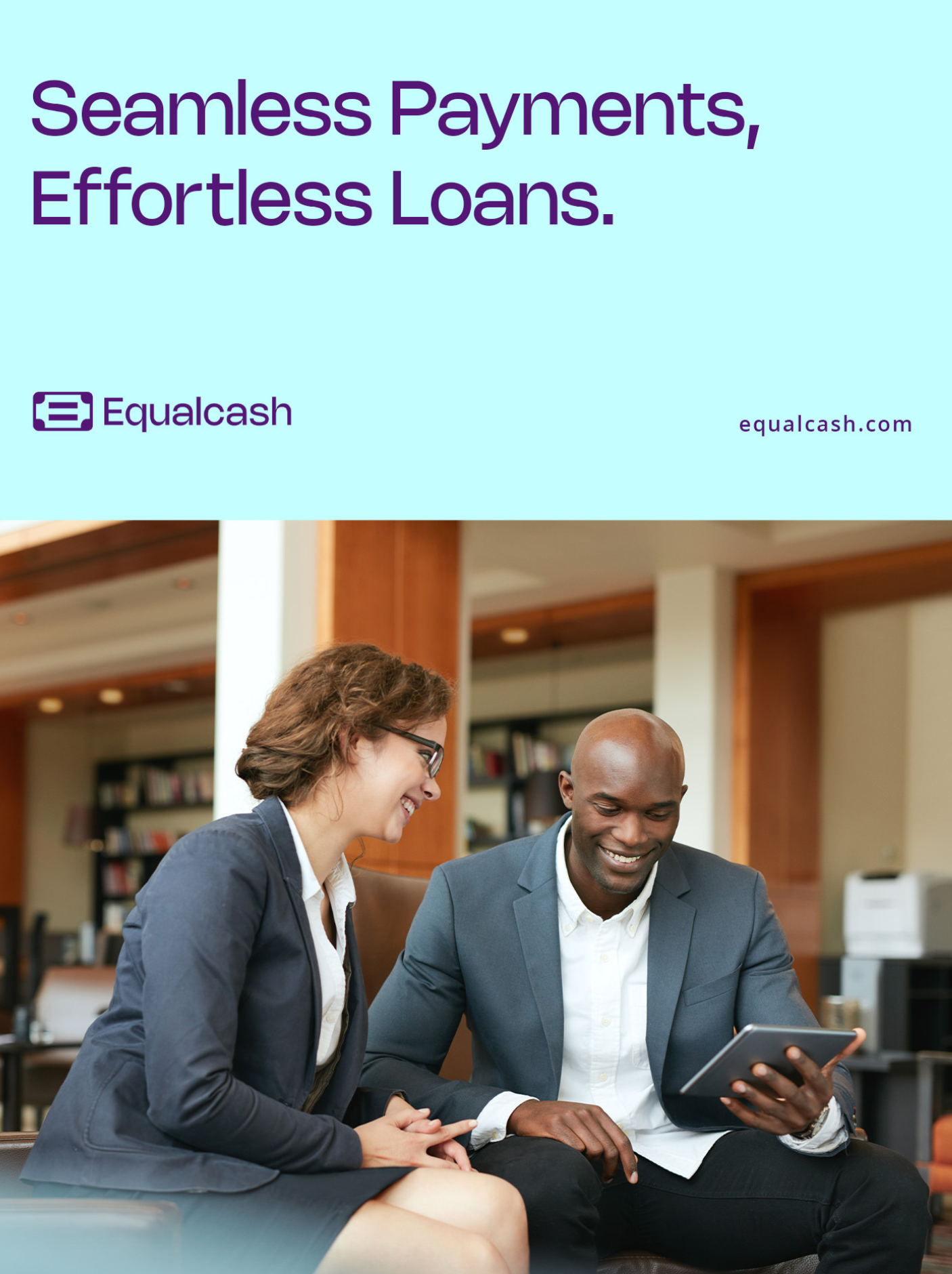
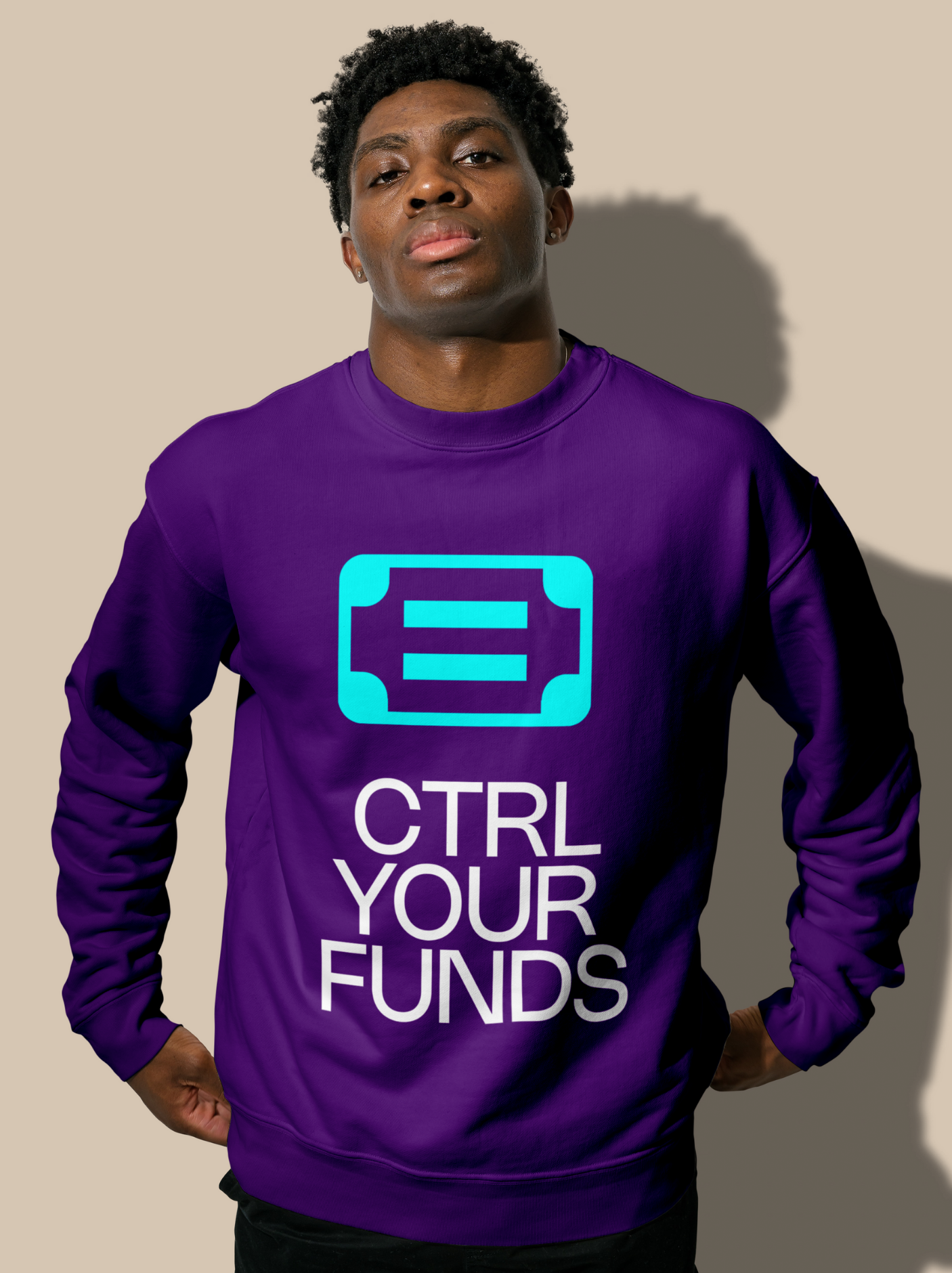
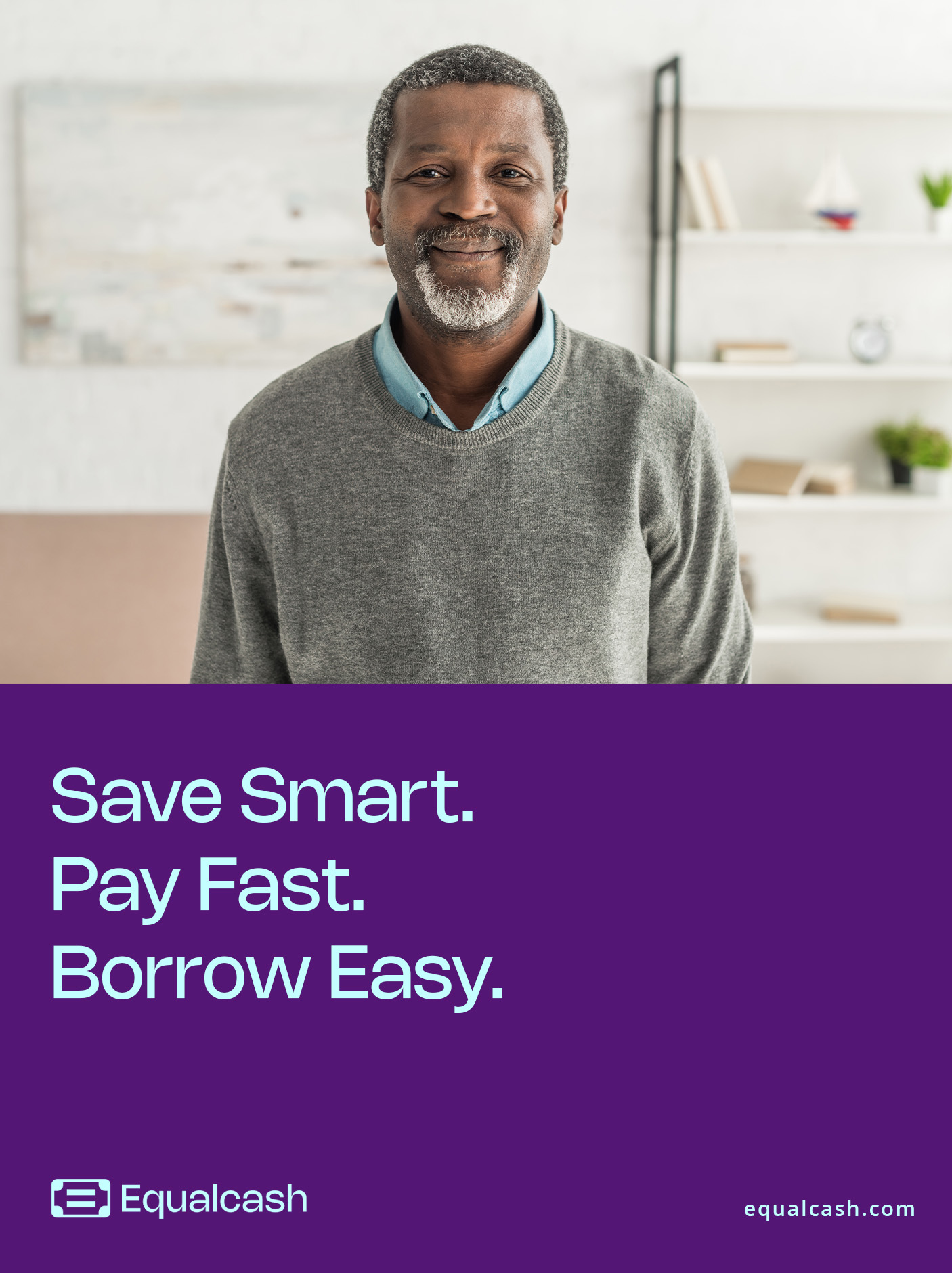
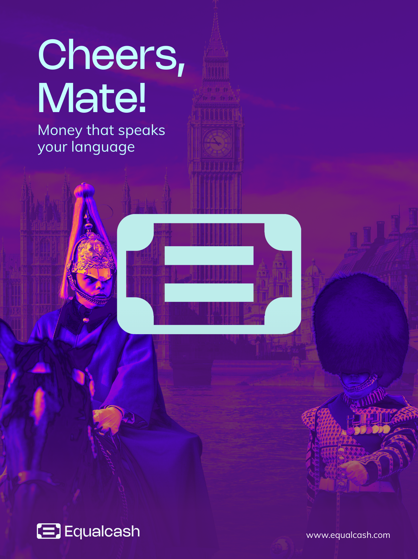
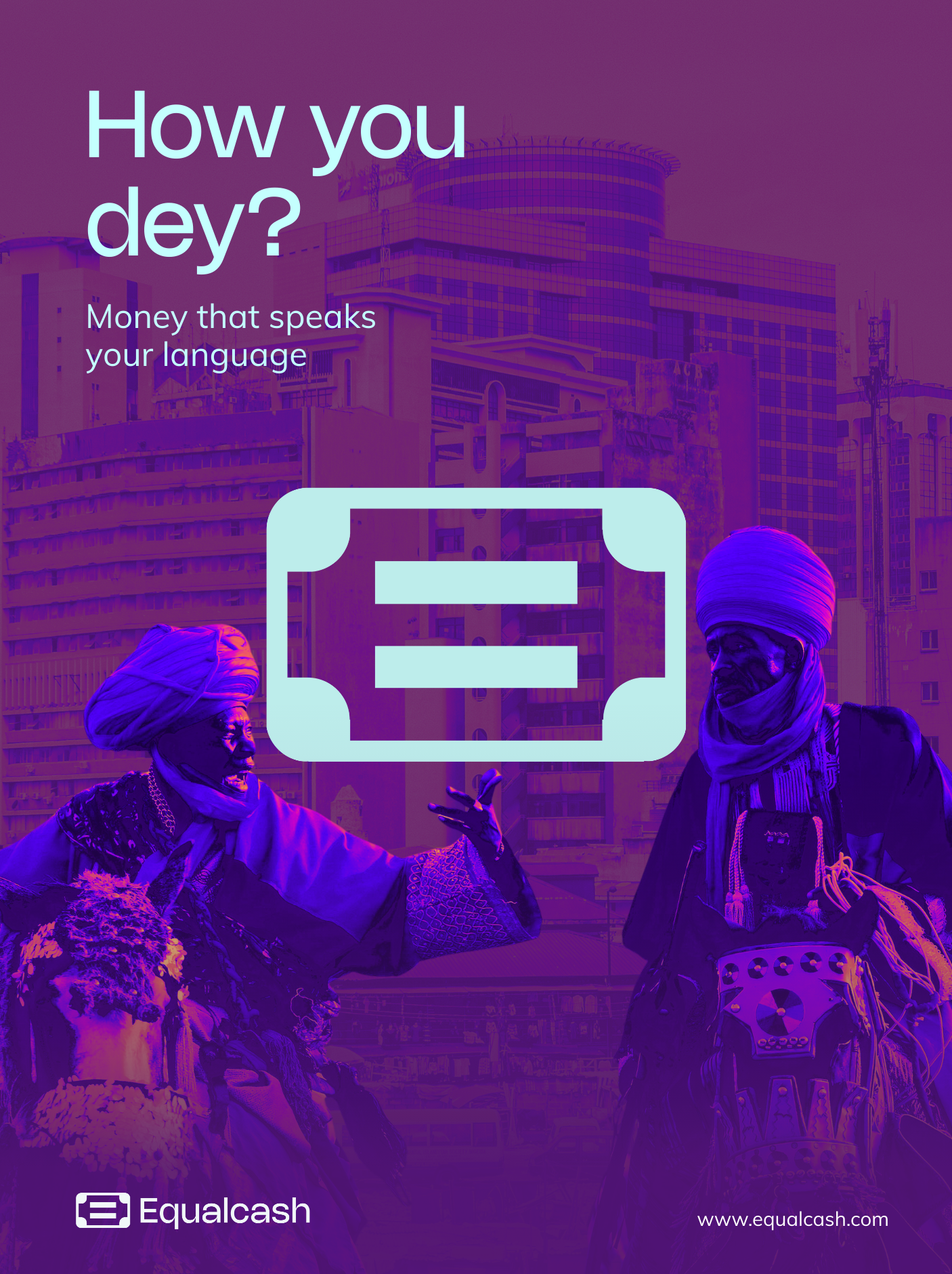
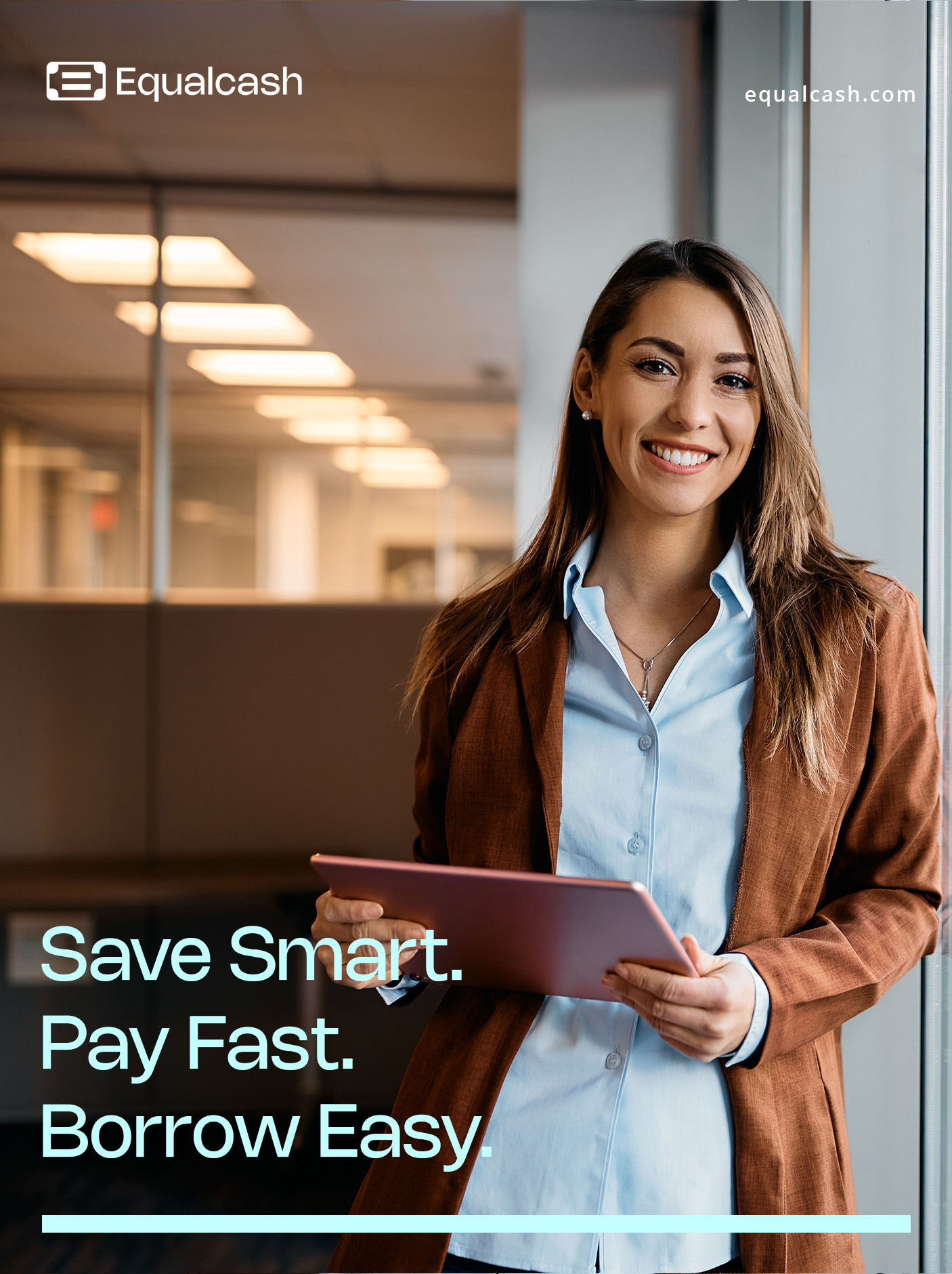
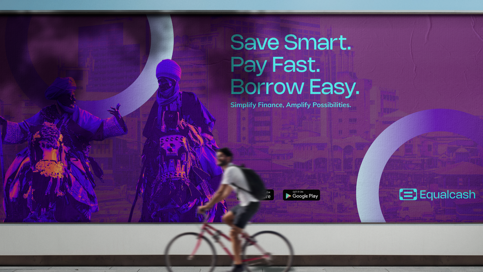
The launch of Equalcash made an immediate mark. With a bold, vibrant identity, a distinctive visual system, and messaging that spoke human-first, the brand stood out in a sea of sameness. Its cyan-and-purple palette became instantly recognizable across mobile and digital touchpoints, while its clear voice—“Save Smart. Pay Fast. Borrow Easy.”—cut through fintech jargon. Within weeks of launch, Equalcash didn’t just earn downloads; it sparked excitement, trust, and community. Today, it’s more than a financial app—it’s a living, breathing movement for equal opportunity in money management worldwide.
3, Summerland Terrace,
Etobicoke, Toronto, Canada
M9A 0B4
2, Allen Avenue, 1st Floor Gabriel
Akinmade Taylor Plaza, Ikeja
Lagos, Nigeria
.png)